Animations

As of the 23rd May 2022 this website is archived and will receive no further updates.

understandinguncertainty.org was produced by the Winton programme for the public understanding of risk based in the Statistical Laboratory in the University of Cambridge. The aim was to help improve the way that uncertainty and risk are discussed in society, and show how probability and statistics can be both useful and entertaining.

Many of the animations were produced using Flash and will no longer work.

Many of our articles make use of illustrative animations which we try to make as reusable as possible. If you have some data which could benefit from one of these visualisations, we encourage you to go ahead, but do get in touch. Here we list all the embeddable animations we have created so far.

Thumbnails link to the live animation, and titles link to a (possibly) expanded version of the catalogue entry.

Within each animation, the about button provides author and licensing information and links to the original articles. The embed button gives you code that can be pasted into an HTML file. If you upload the code to a web server, we will need to enable it for you before it will work.

Micromorts

Link to Risk CalculatorIt's sometimes helpful to compare one kind of activity with another when trying to understand risk. In this animation we compare risks side by side using the idea of a micromort. See the article Small but Lethal on Plus.

Spinning the Risk

Link to Spinning the Risk AnimationThis animation is designed to alert you to the huge number of sometimes misleading ways that the same risks can be presented - relative or absolute, positive or negative framing, percentage chance or natural frequency, both graphically and in text.

Screening Tests

Link to Screening test AnimationThis animation is helpful in showing how the results of screening a population for something uncommon need careful interprepretation.

Survival

Link to Survival AnimationOur Survival animation displays life tables. See how your survival prospects have changed over time and how they are affected by age, gender, and behaviour.

Nightingale's Rose


Nightingale's coxcombs
Florence Nightingale kept meticulous records of the large number of deaths due to poor sanitary conditions compared to the number of deaths due to fighting during the Crimean War. Following the war she produced powerful graphs – now often known as 'roses' or 'coxcombs' – to represent this data. We have animated Nightingale's Roses, and included a bar chart of the same data for comparison.

Survival Worldwide

Link to Survival AnimationOur Survival Worldwide animation visualises life table data from the Human Life Database maintained by the Max Planck Institute for Demographic Research (Rostock, Germany), the Department of Demography at the University of California (Berkeley, USA), and the Institut national d'études démographiques (Paris, France).

Football Leagues


Football
In Football Leagues we have animated bar charts of the league tables of football leagues from across Europe over the past ten years. See Premier League for a discussion of luck in the distribution of points in the Premier League, and check out our predictions for the final week of the Premier League 2008-2009 in One game to play!

Chance Leagues

Football Consider a league in which each team plays each other team exactly twice (both home and away) and the outcome of each match is determined randomly according to a fixed set of three probabilities of home wins, draws, and away wins that are independent of the match and the teams involved. What would the league table look like at the end of the season?

Risk Balance

Risk balance icon 
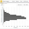
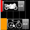
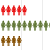
This animation can be used for comparing risks under two sets of circumstances. Risks are compared using two back-to-back bar charts which can be filled either with a solid colour, or with icons.

Numerators and Denominators

iconWhen assessing a risk it's sometimes helpful to have a picture. Here, you can display a risk as a visual fraction of people - numerator over denominator. A maximum of 1000 people are displayed, but you may enter a denominator up to 10000 since the visualisation is capable of displaying tenths of a person. You can also ask it to display things like 8.3 out of 100.

Lightning simulator

iconThis is really a quincunx made to look like lightning for a bit of fun. The lightning has to make 20 left or right choices on its way to the ground. If the stick man stays put he has a 1 in $2^{20}$ chance of being struck on each flash. That's roughly one micromort. As the strikes hit the ground the number of hits in each place appears as a bar chart.

WallyLotto

icon
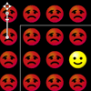
In this animation, a happy smiley has won the lottery. The other 16,777,215 sad smileys all lost. Can you find the winner? We've given you some help - he's in the square outlined in white, and you can zoom and pan to find him. In the standard 6 ball 1-49 lottery, the chance of matching all 6 is comparable at 1 in 13,983,816.

View full screen

PRAiS2 project development work

PRAIS2 project announcementUnderstandingUncertainty is helping develop and test the outputs of the PRAiS2 project led by Christina Pagel at UCL.

Football League 2016 update

Football

This is a 2016 update to our football league animation for the English premier league