Submitted by david on Wed, 18/04/2012 - 4:09pm
Written instructions used to explain survival curves to participants in Rakow, Wright, Bull and Spiegelhalter (in press, Medical Decision Making).
For simple survival curves, all participants read the same set of instructions.
For multi-state survival curves, participants read one of two sets of instructions (depending on the kind of graph that they would subsequently see).
Submitted by gmp26 on Mon, 13/07/2009 - 9:17am
We have adapted 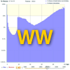 our Survival Worldwide animation to visualise life table data from the Human Lifetable Database maintained by the Max Planck Institute for Demographic Research (Rostock, Germany), the Department of Demography at the University of California (Berkeley, USA), and the Institut national d'études démographiques (Paris, France).
Submitted by gmp26 on Mon, 27/10/2008 - 2:28pm
We thought it would be interesting to extend our Survival animation backwards in time. With some help by the ONS Centre for Demography we've been able to go back roughly to 1845.
Submitted by gmp26 on Wed, 22/10/2008 - 9:57am
This is still a work in progress, but we thought you might be interested in these different ways the data in Charles Minard's map can be visualised. The Minard map is a beautifully clear summary of the progress of Napoleon's 1812 campaign. It depicts a broad river of men flowing eastwards, suffering continuous depletion from disease, desertion and death, with just a few surviving the disastrous retreat.
Submitted by ajp82 on Wed, 20/08/2008 - 9:00am

How long are going to live? showed how the chances of dying each year depend on how old you are and what your health behaviours have been. Here we show how these annual 'hazards', survival curves and life expectancies can all be obtained from data on what proportion of people of each age die each year in the UK.
Submitted by david on Wed, 18/06/2008 - 2:49pm
getting life expectancy from life tables.
Submitted by david on Tue, 03/06/2008 - 4:46pm
How long are going to live? showed how the chances of dying each year depend on how old you are and what your health behaviours have been. Here we show how these annual 'hazards', survival curves and life expectancies can all be obtained from data on what proportion of people of each age die each year in the UK.
Submitted by horace on Mon, 07/01/2008 - 12:08pm
None of us are going to last for ever. Our prospects depend on our sex, our age, our lifestyle, our genes, and many other personal factors both known and unknown. Even with all this information we're all uncertain about the exact date of our death, but by looking at large groups of people who are like us, we can count how many die each year and so get an idea of the risks we face and how long we might live. Our risks can be summarised in different ways which are shown in the animation below.
Submitted by arciris on Fri, 21/12/2007 - 12:22pm
Here, we attempt to explain how the evidence is used to formulate results through the risk calculators.
The calculations are formed by combining the average life span for a population with the average reduction of life-span associated with a particular disease. Calculations get trickier when you want to know the combined risk of more than one disease and behaviour on life-span.
Submitted by arciris on Fri, 21/12/2007 - 11:40am
Our intrepid head of the Understanding Uncertainty team, David Spiegelhalter, booked himself in to see the doctor. At least for purely research reasons we are delighted that we can make use of his newly acquired medical information.
He came out with a rather ominous status of having a 10% risk of heart disease within the next 10 years – a result from his doctor’s calculator.
