What are the chances of successful fertility treatment?
As of the 23rd May 2022 this website is archived and will receive no further updates.
understandinguncertainty.org was produced by the Winton programme for the public understanding of risk based in the Statistical Laboratory in the University of Cambridge. The aim was to help improve the way that uncertainty and risk are discussed in society, and show how probability and statistics can be both useful and entertaining.
Many of the animations were produced using Flash and will no longer work.
![]() The Human Fertilisation and Embryology Authority (HFEA) recently launched their ‘Choose a Fertility Clinic’ website which provides a huge range of information about each clinic licenced by the HFEA, with a lot of fairly complex statistics. The website carefully avoids direct comparisons and any hint of a ‘league table’, but here we look at whether we can draw statistically-valid conclusions about whether some clinics, for whatever reason, really do provide higher chances of success than others.
The Human Fertilisation and Embryology Authority (HFEA) recently launched their ‘Choose a Fertility Clinic’ website which provides a huge range of information about each clinic licenced by the HFEA, with a lot of fairly complex statistics. The website carefully avoids direct comparisons and any hint of a ‘league table’, but here we look at whether we can draw statistically-valid conclusions about whether some clinics, for whatever reason, really do provide higher chances of success than others.
The HFEA rightly points out that there are many features to weigh up when choosing a fertility clinic. The chance of a treatment cycle ending with the birth of a child is not only just one piece of information, but is not even known with much precision.
What the HFEA reports
We will only consider the most common intervention: in-vitro fertilisation (IVF) using fresh embryos from a woman’s own eggs. The main measure of ‘success’ for a clinic is the number of ‘birth events’ per treatment cycle started. For example, the Lister Fertility Clinic had the following results for women under 35.
| Age | Live births per treatment cycle | Predicted chance of an average patient having a live birth | How does this clinic compare to the national average?' |
|---|---|---|---|
| Under 35 | 204 out of 458 | Predicted chance between: 37.5% - 51.8% most likely around: 44.5% |
Above national average live birth rate of 32.3% |
The second column shows the number of cycles started in 2007 (458) and the number of births (204) – note that twins count as a single ‘birth event’ so the second column does not count the number of babies born. The third column shows the observed proportion of birth events (44.5% = 204/458) and a range of values for the ‘predicted chance’. This interval has nothing to do with the fact that patients differ in their chances, and is simply due to the estimated chance for an average patient being based on a limited number of past cases. The intervals tend to be very wide as they are designed, rather unusually, to include the ‘true chance’ in 99.8% of cases.
The final column is important: it assesses whether the clinic appears to have a higher or lower success rate than average: a clinic is labelled as ‘Above national average’ if there is less than a 1 in 1000 chance of getting such a high success rate by chance alone. This essentially means that a clinic should be labelled as ‘Above average’ if the national average (32%) lies outside the range given in the 3rd column: in this case 32% does lie oiutside the range of 38% to 52% and so the results are labelled as 'Above average' (I am deliberately leaving the decimal places off the percentages since there is little point in being so accurate).
Comparing clinics
The HFEA appropriately points out that “The type of patients a clinic treats affects the clinic’s live birth rates. It may therefore be misleading to directly compare the success rates of different clinics as they differ in the types of patients they treat. The majority of clinics perform around the national average.” Nevertheless it would seem useful to be able to visualise all the clinics at the same time and in particular be able to see who, for whatever reason, was classified as being ‘Above’ or ‘Below’ the national average.
One way of doing this is with a ‘funnel plot’, shown below for women under 35. Each dot is a clinic, showing its % success rate (up the side) and the number of cycles started in 2007 (along the bottom). The horizontal line shows the national average (32%), and the two ‘funnels’ show where we would expect the clinics to lie if they were truly indistinguishable from each other. Clinics in the ‘outer’ funnel correspond to those the HFEA have identified as either ‘Above’ or ‘Below’ average. As the HFEA says, the majority of the clinics lie in the funnel and therefore are essentially indistinguishable on this measure, and so we have not even named them. But some are clearly outliers. This may be for a number of reasons: the type of patient, number of embryos transferred, or some other aspect of the treatment given.
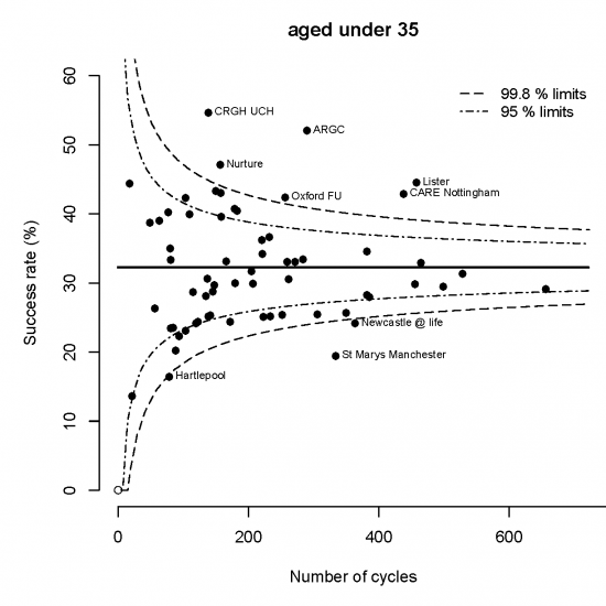
Funnel plot for live births per cycle in women under 35: national success rate is 32%. Clinics outside the outer funnel are judged 'not consistent' with the national average. Reasons for this may vary, but you can be confident that it is not due to chance.
These funnel plots are already being used in informing parents of children with life-threatening heart defects about the survival rates following surgery in different hospitals in England. It’s been found that people understand and welcome this information, and do not automatically favour a clinic with the highest success rate: a clinic with a slightly lower rate but that treats more patients may be preferable, or there are many other reasons for favouring one clinic over another.
Funnel plots for other age groups are given at the end of this article.
Other measures of performance
The HFEA provides many other measures of a clinic’s performance, particularly emphasising the ‘Live births per embryo transferred’. This is a rather strange ratio: in the numerator it counts multiple births as a single event, but in the denominator it counts all the embryos transferred. So say Clinic 1 treated 10 women with 1 embryo each and all 10 give birth to a single child, then this would be a 100% success rate. Then suppose if Clinic 2 treated 10 women with 2 embryos each and again 10 gave birth to a single baby, this would count as a 50% success rate in spite of the outcome for the women being identical. [If the women all had twins, then the success rate would still be 50%].
This outcome measure has been strongly recommended by clinicians who argue that it is more “relevant to the competence of the clinic” than birth events per cycle. It is likely to discourage the use of multiple embryos, which may well be appropriate. But it seems to be an indicator designed for clinicians rather than patients, and so we do not consider it further.
Putting it all together
We can combine the data for all the age-groups by adding up the birth events in 2007 for each clinic to give an Observed total, and comparing it to the Expected number if the clinic’s success rate for each age-group were precisely the national average. The ratio of the Observed to the Expected can be called the “Standardised Birth Ratio (SBR)” and is shown in the funnel below plotted against the Expected number (slightly adjusted to make the funnels correct). Two clinics have more than 50% births more than expected given their age profile: of course there may be many other ways in which their patients differ.
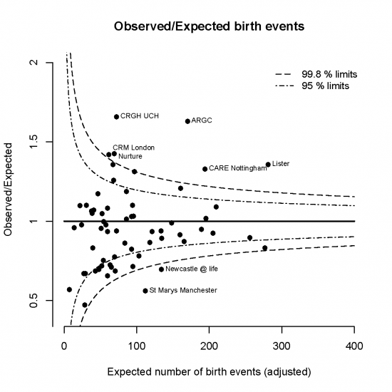
Funnel for the Standardised Birth Ratio (Observed / Expected births, allowing for age of woman)
Can we make a league table?
League tables can be dangerous. As the HFEA repeatedly advises, clinics may differ in their patients and the play of chance can have a dramatic effect on ‘rankings’ when there is really little difference between the clinics. Nevertheless we can use techniques that we have applied to comparing football teams to see whether we can rank the clinics with any confidence: we used these techniques back in 1998 to compare IVF clinics.
The picture below shows the clinics ranked by their standardised birth ratio (SBR), with the Observed and Expected birth events shown as well. But we cannot be sure of a clinic’s ‘true rank’ due to the limited data we have to compare them – their order might change as we collect more data, and the ‘range’ of ranks shows what might happen to the ranks if the clinics each treated a huge number of women. It shows that there are only eight clinics we are confident would stay in the top quarter, and just two are almost certainly in the bottom quarter, and many could end up almost anywhere. So detailed ranking cannot be recommended, although there are clearly some that rank low or high, for one reason or another.
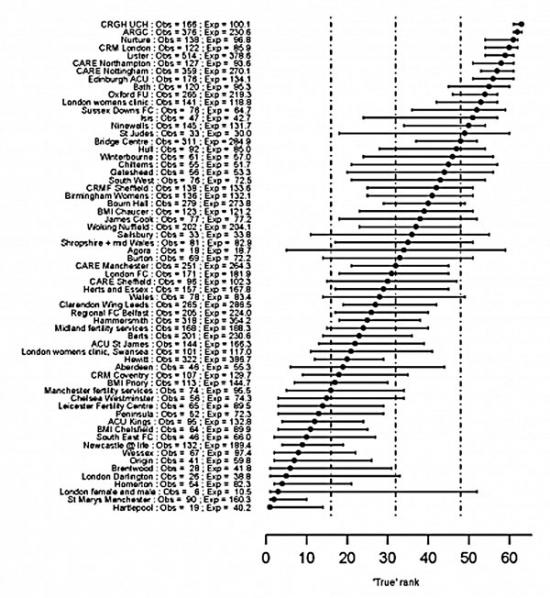
Fertility clinics ranked by their Standardised Birth Ratio, with a range of possible 'true ranks' reflecting the uncertainty about where they would end up if a huge number of women were treated in each clinic
Numbers of multiple births
The HFEA strongly warns about the risks of multiple births. The funnel plot below shows that the rates are essentially indistinguishable between clinics, with only one being clearly higher than the national average.
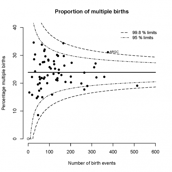
Funnel showing the proportion of multiple births: almost all clinics are essentially consistent with the national average
Other funnel plots
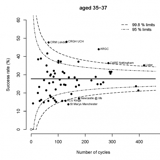
Funnel plot for women between 35 and 37: national success rate is 28%
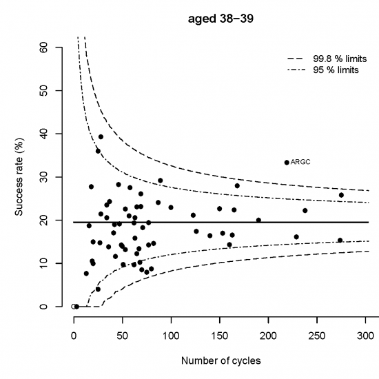
Funnel plot for women between 38 and 39: national success rate is 29%
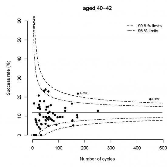
Funnel plot for women between 40 and 42: national success rate is 12%
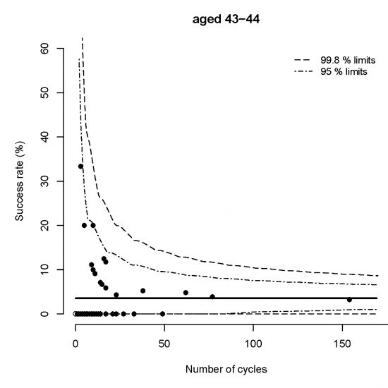
Funnel plot for women between 43 and 44: national success rate is 4%
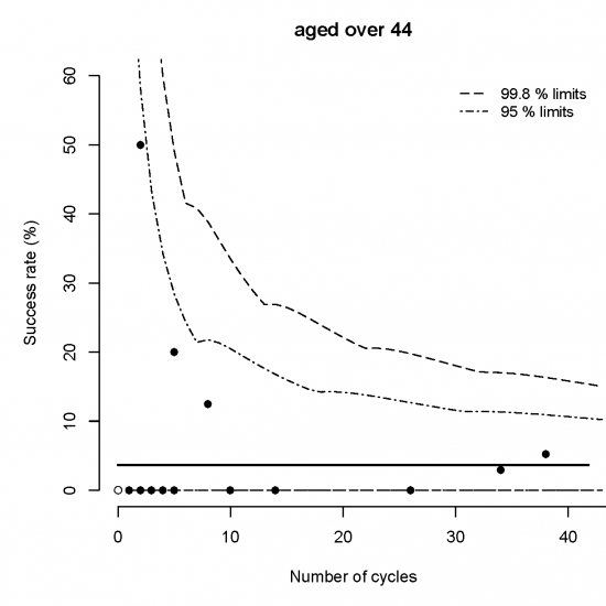
Funnel plot for women over 44: national success rate is 4%
Declaration of Interest
David Spiegelhalter has given advice to the HFEA about the presentation of statistical information.
- Log in to post comments
