Visualising uncertainty
As of the 23rd May 2022 this website is archived and will receive no further updates.
understandinguncertainty.org was produced by the Winton programme for the public understanding of risk based in the Statistical Laboratory in the University of Cambridge. The aim was to help improve the way that uncertainty and risk are discussed in society, and show how probability and statistics can be both useful and entertaining.
Many of the animations were produced using Flash and will no longer work.
We have had a review paper published in Science called Visualising uncertainty about the future, although it primarily focuses on probability forecasts.
You may access the full paper by following the links below.
The Supporting Online Material is available here, but you may find it faster to view them as separate attachments below.
Errata:
- Figure 5A, the MIT roulette wheel, is incorrectly referred to as figure 3A in the text
- The caption for Fig 5D should make clear that the hurricane is not necessarily in Florida - that's just the home of the NHC (National Hurricane Center)
Sadly, we did not include a 'spaghetti plot' in our many examples - really should have but could not find a simple publicly-available one until the week the paper was published, when there was a great use of a spaghetti plot of multiple model predictions for Hurricane Irene in this NBC news bulletin .
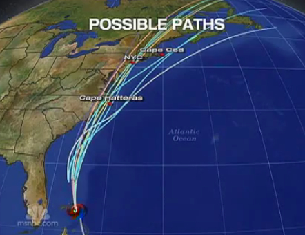
possible hurricane paths
This seems to nicely communicate essential unpredictability through the metaphor of 'multiple possible futures', even though what is being portrayed is between-model disagreement rather than within-model uncertainty.


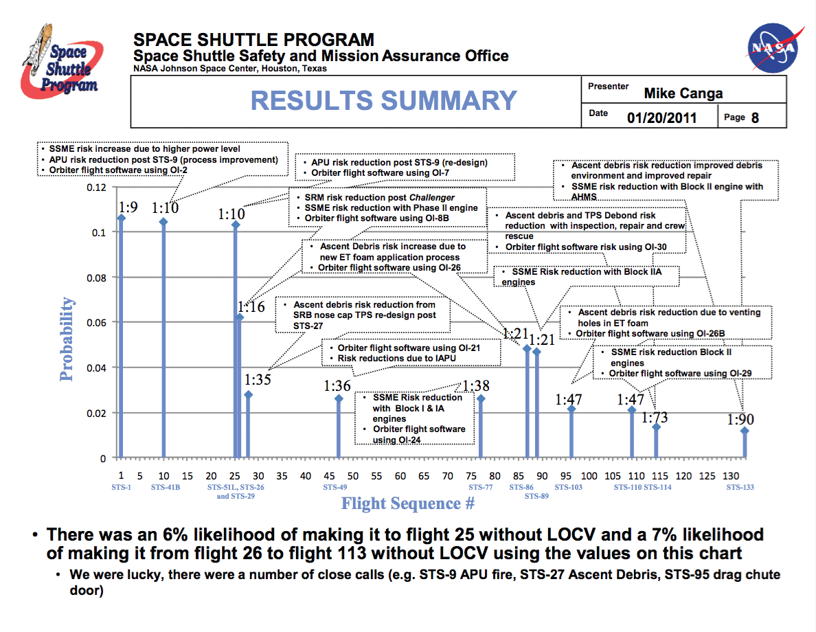
S1: Retrospectively assessed chances of loss of the space shuttle following each launch, with explanations of changes in risk communicated in multiple numerical formats.
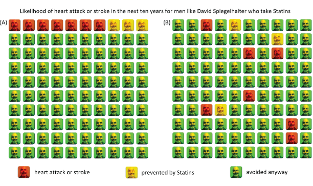
S2: (A) Icon array depicting 100 possible 10-year futures for David Spiegelhalter if he takes statins each day. In 7 possible futures he will have a heart attack or stroke, but in 3 futures his heart attack or stroke will be prevented by the drug. Of course, if he is fine after 10 years he will have no idea if it was because of the drug – in fact there is only 3 in 100 chance that the drug will be of benefit to him (B) The same information portrayed using scattered icons, which gives a greater impression of the unpredictability of life, at the cost of decreased ability to assess the magnitude of the potential benefit.
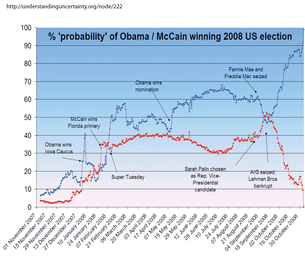
S3: The probability for Obama (blue line) and McCain (red line) winning the 2008 US Presidency as expressed in an online betting exchange each day in the run-up to the election.
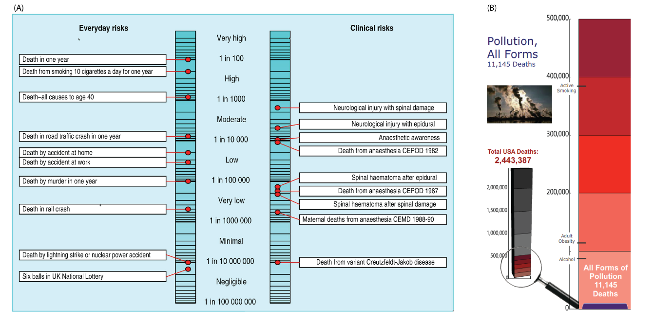
S4: (A) Risk ladder comparing medical risks from anaesthesia with everyday risks such as winning the UK lottery (73). (B) ‘Riskometer’ comparing deaths from pollution with other causes using a magnification of a linear scale. (with thanks to The American Council on Science and Health)"
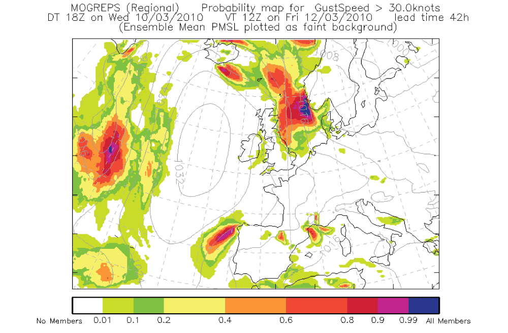
S5: Probability contours for wind gusts above 30 knots over Northern Europe provided by the UK Meteorological Office. This forms part of an animated sequence that vividly depicts the possible developments of weather patterns, and may be compared with the more limited representation of tornado risk in Fig. 5D.
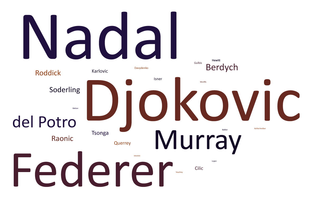
S6: A word cloud in which the font size is proportional to the chance of a tennis player winning the men’s singles tournament at Wimbledon 2011. The probabilities were adapted from odds supplied by the bookmakers William Hill on 1 June 2011, and only the 24 highest rated players are shown, with their quoted odds standardised to add to 100%. A deficiency of word clouds in general is that only relative risks are portrayed, and there is no part-to-whole comparison.

S7: A tree map which displays the same information as Fig. S6. The area of each rectangle represents the probability, according to odds supplied by William Hill on 1 June 2011, that the corresponding player will win the men’s singles tournament at Wimbledon 2011.
- Log in to post comments

Comments
David LeBlond
Thu, 13/12/2012 - 5:02am
Permalink
Your science 2011 article about uncertainty
Maureen Goodin
Wed, 01/05/2013 - 5:29am
Permalink
Thanks