2845 ways to spin the Risk
As of the 23rd May 2022 this website is archived and will receive no further updates.
understandinguncertainty.org was produced by the Winton programme for the public understanding of risk based in the Statistical Laboratory in the University of Cambridge. The aim was to help improve the way that uncertainty and risk are discussed in society, and show how probability and statistics can be both useful and entertaining.
Many of the animations were produced using Flash and will no longer work.
In the animation below we show how risks can be ‘spun’ to look bigger or smaller, how medical treatments can be made to seem useless or to be wonder cures, and how lifestyle changes might look worthwhile or not worth bothering with. All by changing the words used, the way the numbers are expressed, and the particular graphics chosen.
You may like to open a new window on the animation so you can refer to it easily as you read the article. Check back for updates to the animation which will allow you to adapt it to your own data.
Many medical findings about the effect of a treatment are summarised in reports which compare just two numbers; the risk without the treatment and the risk with the treatment - or even just one number, the percentage change in risk. But there has been a lot of research into how people's perception of the magnitude of a risk can be manipulated by changing the way in which that risk is communicated. We have taken a selection of the options that are available, and by putting them together we reckon the animation contains 2845 different ways of expressing the effect on the risk of an event of an intervention: we have chosen as illustration the effect of consuming processed meat, and the effect of taking statins (cholesterol lowering drugs) on a moderate-risk middle-aged man.
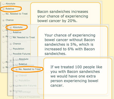
Absolute risks / relative risks / numbers needed to treat
 A good example to start with is ‘bacon sandwiches’. A major report estimated that there was a 20% increased risk of bowel cancer if you ate 50g of processed meat every day – that’s a large bacon sandwich. We've discussed the way this story was handled by the media, including the wonderful headline from the Sun: "Careless pork costs lives!". This is a relative risk, and can sound quite frightening. But for an average person, the chance of getting bowel cancer at some point in their life is around 5%. A 20% relative increase on this translates to a lifetime risk of 6%, or an increase of 1% in absolute risk, which now does not sound so bad.
Yet another way to think of this is to consider how many people would need to eat large bacon sandwiches all their life in order to lead to one extra case of bowel cancer. This final quantity is known as the number needed to treat (NNT), although in this context it would perhaps better be called the number needed to eat. To find the NNT, simply express the two risks (with and without whatever you are interested in) as decimals, take the smaller from the larger and invert: in this case we get 1/(0.06 – 0.05) = 100. Now the risks do not seem at all remarkable.
Try these buttons on the animation to see how the text changes – it has been shown in experiments that these different ways of expressing risk differences can carry very different messages to people. One of the most misleading, but rather common, tricks is to use relative risks when talking about the benefits of a treatment, for example to say that "Women taking tamoxifen had about 49% fewer diagnoses of breast cancer", while harms are given in absolute risks - "the annual rate of uterine cancer in the tamoxifen arm was 30 per 10,000 compared to 8 per 10,000 in the placebo arm". This will tend to exaggerate the benefits, minimise the harms, and in any case make it unable to compare them. This is known as 'mismatched framing', and was found in a third of studies published in the British Medical Journal.
Comparing relative, absolute and Number Needed to Treat or Harm
Chance / population / possible futures
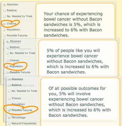
We can also change what we mean by the number we put on a ‘risk’. First, we can talk about the chance of getting bowel cancer, with the idea that this is an event that is like the flip of a coin or a throw of dice, unpredictable but with some physical basis. This creates an image of life as a gamble with the outcome determined by some invisible mechanism over which we have no control. A very popular alternative, used by most people trying to communicate risk, is to think of the frequency of the event is expected to occur in a population of similar individuals, that is a group of ‘people like you’, some of whom will get bowel cancer and others won't. A disadvantage if this analogy is that it is easy for me to think that 100 people like me don't exist, and even if they do then I am going to be one of the lucky ones. To make it impossible to see the problem as belonging to other people, we've included the option of possible futures about the ways things may turn out for you in the future: in what proportion of these alternative worlds will you get bowel cancer? This may be a bit shaky philosophically (and it is perhaps best to avoid ideas of parallel universes), but it personalises the risk while keeping in a simple frequency language.
Comparing ways to understand the risk
Percentage / frequencies
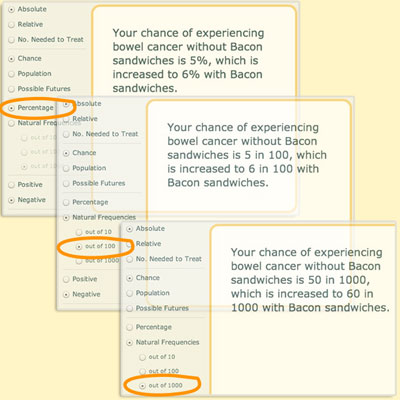
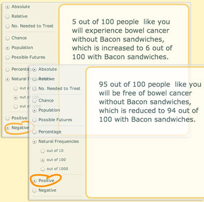
Probabilities can be expressed as fractions (eg 1/2), decimals (0.5), percentages (50%) or frequencies (5 out of 10). In the animation we just have percentages or frequencies, but allow you to decide whether to have 5 out of 10, 50 out of 100, or 500 out of 1000. It may seem these choices are irrelevant since they all express the same proportion, but it has been shown in experiments that the size of the numerator and denominator change people’s perception of the size of the risk. For example, people have been offered a prize if they drew a red ball from a bag, and then given the choice of two bags: one containing 1 red ball and 9 white balls, the other having 8 red balls and 92 white balls. The majority chose the bag with 8 red balls, presumably reflecting a view that it gave more opportunities to win, even though the underlying chance was lower. Similarly people confronted with the statement “Cancer kills 2,414 people out of 10,000” rated cancer as more risky than those told “Cancer kills 24.14 people out of 100”. The potential influence of the size of the numerator and denominator is known as the 'ratio bias'.
Frequencies are generally used in risk communication, but it is important to keep a common denominator in all comparisons: for example to describe what is expected to happen to 1000 women who go for screening for breast cancer, no matter whether they benefit or are harmed by the test.
Comparing Percentage and Natural Frequencies
Positive / negative framing
What would you prefer, a game in which you had a 10% chance of winning, or one with a 90% chance of losing? You may shake your head and say that they are exactly the same, but it has been shown that it can make a big difference whether an outcome is expressed positively or negatively. For example, in a classic experiment, one group of people were told
‘Of 100 people having surgery for lung cancer, 10 will die during treatment, 32 will have died by one year and 66 will have died by five years. Of 100 people having radiation therapy, none will die during treatment, 23 will die by one year and 78 will die by five years.’
When framed in these negative terms, the risks of surgery appear large and 42% preferred radiation therapy. Others were told
'Of 100 people having surgery, 90 will survive treatment, 68 will be alive at one year and 34 will be alive at five years. Of 100 people having radiation therapy, all will survive treatment, 77 will be alive at one year and 22 will be alive at five years.’
When framed in these positive terms, surgery appears much more attractive and only 25% preferred radiation therapy.
Framing inevitably influences perception, so it best to provide both a negative and positive description of the chance of an outcome.
Comparing positive and negative framing
Words / graphics / animations
So far we have only looked at the words that can be used, but each of these phrases can be accompanied by a picture. Pie charts are popular, and as we see below can reflect both a negative (getting cancer), and positive (being free of cancer) framing.
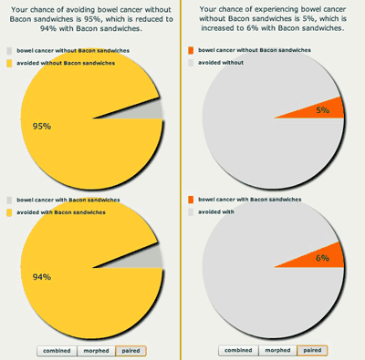
Comparing positive and negative framing of the bacon sandwich risk
Column charts are again very popular, but as we see below the perception of the importance of a change in risk can ve manipulated by altering the scale of the column - the effect of eating bacon looks a lot larger in the second chart.
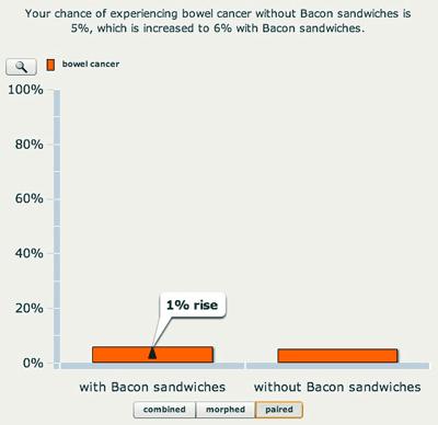
Bar chart on a 0 to 100% scale
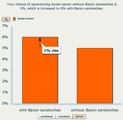
Bar chart on a 0 to 7% scale
Using frequencies naturally leads to using icons to represent people or possible futures. We have allowed blobs, tallies, smiley faces, and even photographs to further personalise the information. There is the choice to have the possible outcomes grouped or scattered: grouping makes them easier to count and can make the risks look larger. Colour can also influence perception, for example with attention pulled towards the outcomes coloured red.
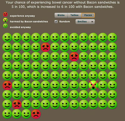
Your chances out of 100
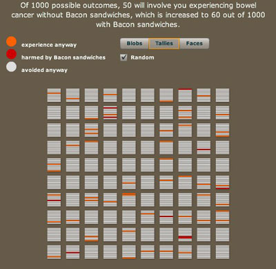
1000 possible futures, arranged randomly
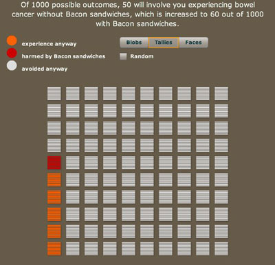
1000 possible futures, arranged tidily
Conclusions
Experts in the area of risk communication have reviewed all the research but have been able to draw few firm conclusions. People are different in their demands, tastes and understanding – there is no one-size-fits-all solution, and so it seems reasonable to use techniques that can be adapted to individuals. However it is clear that certain practices should be avoided as they can clearly bias perception, for example mismatched use of relative and absolute risks, changing denominators, emphasising a negative or a positive frame, and so on.
It's also important to ask - what is it all for? Are we just trying to interest people with attractive attention-drawing displays, or are we trying to increase their knowledge, or even change their behaviour? These multiple aims are not necessarily all achieved using the same technique.
And of course it is vital to remember that information plays a limited role in anyone's perception of the size and importance of a risk. Bigger influences will be their emotional response to the situation, their feelings of control, their dread of the outcome, how much they trust those giving the information, how familiar they are with the problem, what their friends and family think, and so on. But even if people are not going to take a very mathematical approach to the numbers, it still seems essential that they should have access to this information in a fair and balanced way.
Additional reading and links
There is a huge literature on risk presentation and we can only provide some pointers. An excellent resource is the polemical article by Gigerenzer and colleagues: Helping Doctors and Patients Make Sense of Health Statistics. Smiley-face representations have been developed by Chris Cates. A recent review article Numeric, Verbal, and Visual Formats of Conveying Health Risks: Suggested Best Practices and Future Recommendations by Isaac Lipkus is freely available, as is a more formal review from 2001: Presenting Risk Information—A Review of the Effects of ‘‘Framing’’ and other Manipulations on Patient Outcomes by Edwards and colleagues.
We are very grateful to Dr Tim Rakow for help with ideas and examples.
- Log in to post comments

Comments
Anonymous (not verified)
Tue, 25/08/2009 - 3:39am
Permalink
financial risk
deanalarson
Thu, 07/10/2010 - 11:31pm
Permalink
Pros and Cons
Anonymous (not verified)
Tue, 25/05/2010 - 12:04pm
Permalink
Personalising the Data
gmp26
Tue, 01/06/2010 - 10:28am
Permalink
Some pointers
Greg, if you send a message using our contact form including your email we can give you more specific help. Meanwhile, your message has prompted me to write up some help instructions on the Spinning the Risk animation page. Look for them there below the animation itself.
--
Mike Pearson
jazzi
Tue, 18/01/2011 - 3:37pm
Permalink
This is a very good way to
StewGreen.com (not verified)
Mon, 28/11/2011 - 11:52am
Permalink
Impressive ideas & impressive programming
Stew Green (not verified)
Mon, 28/11/2011 - 12:18pm
Permalink
Channel 4 short video picked up the ideas