A contender for 'The worst info graphic of 2011' award
As of the 23rd May 2022 this website is archived and will receive no further updates.
understandinguncertainty.org was produced by the Winton programme for the public understanding of risk based in the Statistical Laboratory in the University of Cambridge. The aim was to help improve the way that uncertainty and risk are discussed in society, and show how probability and statistics can be both useful and entertaining.
Many of the animations were produced using Flash and will no longer work.
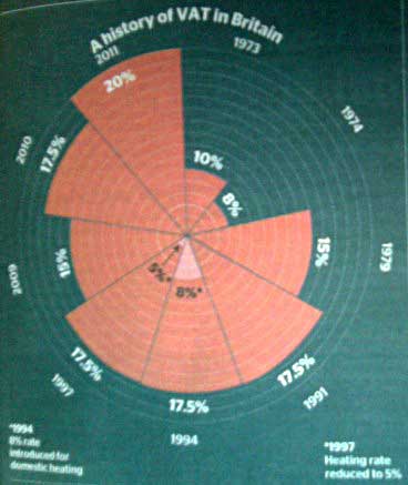 We may already have a winner for the 'Worst info graphic of 2011 award' with this panel which appeared in the Times yesterday (Jan 4th).
A history of VAT in Britain
The diagram is clearly inspired by Florence Nightingale's 'Coxcombs', but there I'm afraid the similarity ends. Nightingale understood that the graphical impact of any sector was in its area and plotted her data accordingly. Our Times journalist however, is happy to subtract 4% from the VAT rates and plot that figure on a radius, helpfully highlighting the 8% rate within the 17.5% sector so we can fully appreciate what a tiny proportion 8% is of 17.5% (let alone 20%).
We feel that the misrepresentation of the data here far outweighs any wow factor from the unusual design. There's real political bias in the diagram too. It may not be intended, but it is there nonetheless. Remembering that area is proportional to graphical impact, and choosing units so 17.5% has area 100 we can even calculate how much!
| VAT Rate | Area (scaled so 17.5% is area 100) |
|---|---|
| 20% | 140 |
| 17.5% | 100 |
| 15% | 66 |
| 10% | 20 |
| 8% | 9 |
The VAT rise from 17.5% to 20% is made to appear like a 40% increase! That's really quite impressive.
Of course, many other media outlets have erroneously reported the increase as one of 2.5%. Very few reporters appear to be interested in the percentage increase in produce costs - which is 2.1% $= \frac{2.5}{117.5} \times 100$ or in the percentage increase in VAT - which is 14.3% $= \frac{2.5}{17.5} \times 100$.
- Log in to post comments

Comments
Anonymous (not verified)
Mon, 10/01/2011 - 10:57pm
Permalink
And don't forget purchase tax
Anonymous (not verified)
Thu, 13/01/2011 - 10:06am
Permalink
Bar chart?
Anonymous (not verified)
Sat, 22/01/2011 - 8:02pm
Permalink
Not sure about the 143
gmp26
Fri, 28/01/2011 - 3:00pm
Permalink
Thankyou!
Well spotted - you're right. I've corrected the article now.
Anonymous (not verified)
Tue, 01/03/2011 - 12:35pm
Permalink
A higher rate