Three-fold variation in UK bowel cancer death rates (?)
As of the 23rd May 2022 this website is archived and will receive no further updates.
understandinguncertainty.org was produced by the Winton programme for the public understanding of risk based in the Statistical Laboratory in the University of Cambridge. The aim was to help improve the way that uncertainty and risk are discussed in society, and show how probability and statistics can be both useful and entertaining.
Many of the animations were produced using Flash and will no longer work.
 I've taken the headline from this BBC story. The three-fold variation is between Rossendale, in Lancashire, where there were 9 deaths per 100,000 people, and Glasgow City, where there were 31 deaths per 100,000. It's based on this press release from the charity Beating Bowel Cancer,
which tells us:
Whilst the causes of these variations are not clear, factors such as low participation in bowel cancer screening, poor awareness of bowel cancer symptoms and unhealthy diets and lifestyles, all play a part.
Nowhere in either source is consideration given to how much of the variation might be due to chance: that's what this article is about.
The press release announces a "Bowel Cancer Map" which gives bowel cancer incidence and mortality figures from 2008 for every local authority in the UK, barring a few small ones for which data are unavailable. To do the statistical analysis I scraped all the data off the website and into a spreadsheet.
The press release assumes that there are causes, varying from district to district, which explain the variation. But let's try instead a null hypothesis that there is no variation in expected death rate from one district to another. Under that hypothesis, the expected number of deaths in each district will be the national death rate (per person) multiplied by the age-standardized population of the district. The actual number will be a random sample from a Poisson distribution with mean equal to the expected number of deaths. The actual rate is obtained by dividing the actual number by the age-standardized population.
The data include the actual number of deaths and the age-standardized death rate per 100,000. Dividing one by the other and multiplying by 100,000 gives us the age-standardized population. I ran a simulation on the spreadsheet in which I sampled the appropriate Poisson distribution for each district, and then found the highest and lowest death rate nationally. And, computers being good at this sort of thing, I repeated it 100 times.
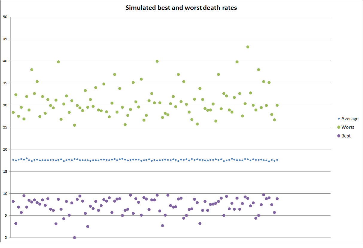
We see that random variation alone is easily sufficient to explain the observed death rate range of 9.16 to 31.09
However, that's not the whole story. Random variation affects low-population districts more than high-population districts - the standard deviation of the death rate will decrease according to the square root of the population. To compare districts of different sizes we use a funnel plot.
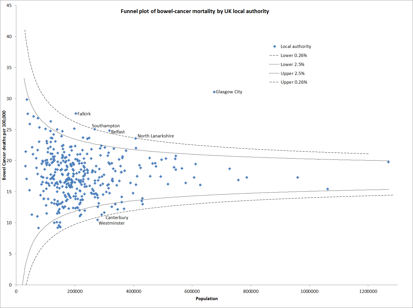
The dotted funnel lines are drawn so that if the expected death rate is the same for every district, the probability that each point falls above the upper line is 2.5%, as is the probability that each point falls below the lower line. The dashed funnel lines are drawn so that the probability that each point falls above the upper line is 1 in 378 - there are 378 districts plotted, so we expect one point to fall above the line. Similarly for the lower dashed line.
What stands out is that the death rate for Glasgow City is remarkably high. We concluded earlier that there's nothing unusual about getting a death rate of 31 somewhere, but getting such an outlier in such a populous district is highly significant. There may be a meaningful pattern too in the figures for North Lanarkshire and Falkirk, which cover the area from Glasgow east-north-east to the Firth of Forth above Edinburgh. Apart from this, the points fit into the funnel roughly as they would if the expected death rate were the same everywhere. There is nothing remarkable about the low death rate in Rossendale: it has a small population and there is a 4.1% probability that it will get that many deaths or fewer under the assumption that the expected rate is the same across the UK.
Is there a difference between the four countries of the UK? The map reports death rates by country: I can reproduce these almost exactly from the district-level data (the small differences may be because Beating Bowel Cancer has figures for the small districts for which the map reports that data is unavailable). Here's a funnel plot for the four countries:
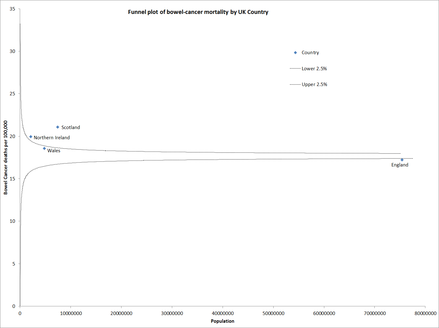
The death rate in Scotland and Northern Ireland is significantly higher than in England.
If the expected death rate differs between Scotland and England, it's worth exploring whether there's significant variation within each country from the country's expected death rate. Here's a funnel plot for Scotland:
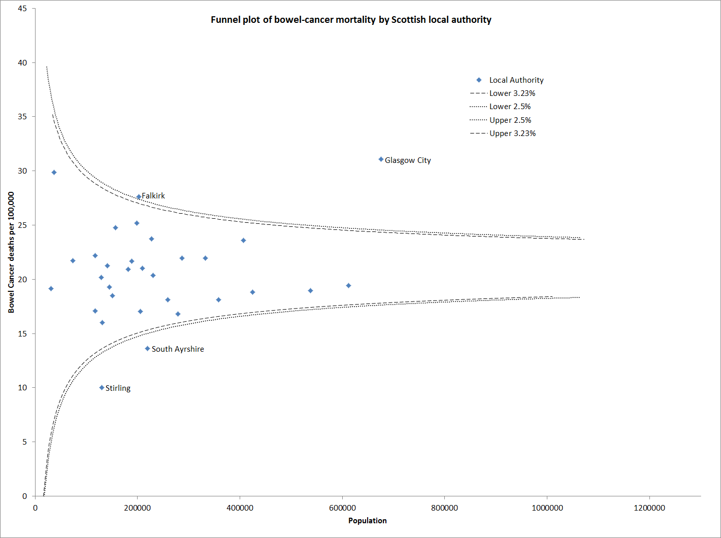
The dotted funnel lines here are drawn so that we expect one point above the upper line and one below the lower line. Even relative to the rest of Scotland, Glasgow City is a big outlier.
And for England:
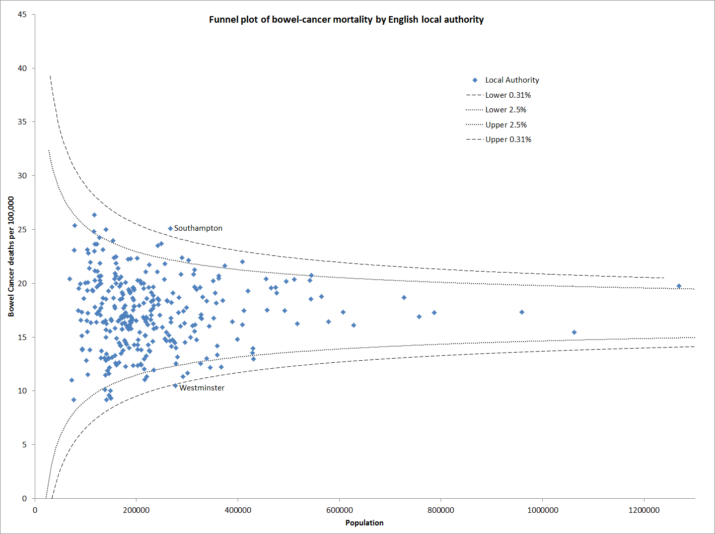
Nothing to see here.
The sub-heading of the press release says Beating Bowel Cancer calculates that over 5,000 lives could be saved every year. No working is given, but the number is consistent with reducing the national death rate to that of the best district - 9.16 per 100,000. I calculate that for a UK population of 61.40million, as officially reported for 2008, that would save 5,231 lives each year. This projection is misguided: the statistical analysis does not suggest that 9.16 is the expected death rate anywhere. The analysis does suggest that the expected death rate is lower in England: if the UK average could be reduced to the English average that would save 282 lives.
[This paragraph has been amended from the version first published.] There's a caveat about the data from Beating Bowel Cancer. Adding up the populations for each area, calculated from the deaths and death rates, I get a UK population of 89.75 million, 46% too high. Cancer Research UK has published a table for 2008 which has about the same number of deaths (16,259 against 15,867 plus a few more in the small unreported districts) but a substantially higher death rate, and an age-standardized table which gives a similar death rate. The Cancer Research UK table notes that the age-standardized rates are "European", which I suppose means that they are age-weighted to give the mortality rates if the age distribution were the same as the European average. The effect of this weighting is that actual mortality is substantially higher than the age-weighted figures suggest.
Author: Paul Barden is a quantitative analyst with an amateur interest in medical statistics. He is currently taking a break from the City. You can find out from his blog what thoughts he's got to share.
- Log in to post comments

Comments
Meic Goodyear
Wed, 05/10/2011 - 8:03am
Permalink
Great analysis, but in
Stephen (not verified)
Sat, 08/10/2011 - 10:12am
Permalink
Glasgow City
paulbarden
Wed, 26/10/2011 - 11:32pm
Permalink
In reply
Thanks Meic, I've corrected the error.
Stephen, I agree that the Glasgow City number should be treated cautiously.
Steve B (not verified)
Thu, 03/11/2011 - 2:04pm
Permalink
one year's data