Lottery league tables
As of the 23rd May 2022 this website is archived and will receive no further updates.
understandinguncertainty.org was produced by the Winton programme for the public understanding of risk based in the Statistical Laboratory in the University of Cambridge. The aim was to help improve the way that uncertainty and risk are discussed in society, and show how probability and statistics can be both useful and entertaining.
Many of the animations were produced using Flash and will no longer work.
The Daily Mail and other media sources have featured league tables for the 'luckiest parts of the country' based on the proportion of the population that have become millionaires by winning the lottery. Straight Statistics have done a nice demolition job on this absurd story, pointing out that any comparison should be based on the number of tickets sold, not the population.
The Daily Mail showed the league table below, and trumpeted that the North East was the luckiest region and Northern Ireland the unluckiest.
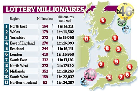
Lottery luck map according to the Daily Mail
Nobody seems to have identified an important and predictable feature - the areas at the top and bottom of this spurious league table all have the lowest numbers of winners, while the ones in the middle have the most. In a completely random event such as choosing a winning lottery ticket, we would expect things to average out more in the bigger regions, while the smaller areas such as Northern Ireland would be expected to be more extreme as they are influenced far more by luck (and by 'luck' I mean happening to do well in a completely chance event).
A better way to make comparisons between areas or institutions of different sizes is to use a funnel plot - see our analysis of IVF clinics. We first have to calculate the expected number of winners in each area, given it's all just chance. As we don't know ticket sales we've based this on the overall rate of millionaires in the country (1 in 17,000) applied to the population in each area. This expectation is plotted along the horizontal axis, so that the bigger areas are to the right. On the vertical axis we put the ratio of observed winners to expected winners, so that the North East comes top with 20% more than expected and Northern Ireland comes bottom with 30% less than expected. But just by chance there will always be scatter of these points - we will never get exactly the expected number and the two funnels show where we would expect 95% or 99.8% of points to lie if everything was just chance. The funnel shape occurs because there is less relative variability for bigger areas - things average out more - whereas smaller regions are affected more by the play of chance.
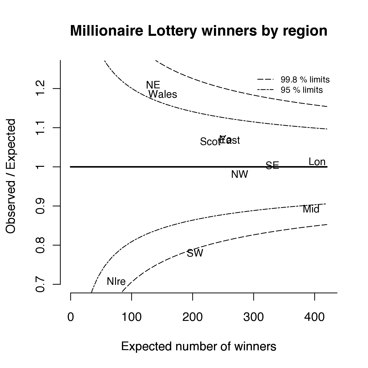
Funnel of lottery millionaires in different areas, adjusting for population but not ticket sales
It turns out that it is actually the South West that is the most unusual result, as there is only 1 in 1000 chance of lying below the outer funnel if it was all just chance AND people bought lottery tickets at the same rate across the country. If we had calculated our Expected number of winners using ticket sales rather than population then all the areas are likely to lie in the central funnel and almost certain to lie in the outer funnel. Of course, if it really did turn out that an area lay outside the funnels when properly taking ticket sales into account, then far from being a light news story it could well be grounds for legal action against Camelot.
As Straight Statistics pointed out, one of the reasons for fewer lottery ticket sales per head in Northern Ireland may be because of purchases of Irish Lottery tickets. The Irish Lottery is notorious for publishing drivel about which numbers to choose: their 'expert advice' for this week's draw is not to choose previous numbers but to select two numbers in sequence.
All this ridiculous story shows is that people in the South West and Northern Ireland must buy fewer lottery tickets, and that Camelot and other lottery organisers appear to think it advantageous to prey on people's superstitions.
- david's blog
- Log in to post comments

Comments
Rick Wicklin (not verified)
Fri, 16/09/2011 - 1:36pm
Permalink
Funnel Plots
mark (not verified)
Sun, 25/09/2011 - 11:48am
Permalink
thanks
I've read about funnel plots and it's good to see them in action.
The More or less episode about when to buy a lottery ticket was amazing
http://www.bbc.co.uk/iplayer/episode/b0132pk7/More_or_Less_12_08_2011/ (towards the end)