Another doubtful league table?
As of the 23rd May 2022 this website is archived and will receive no further updates.
understandinguncertainty.org was produced by the Winton programme for the public understanding of risk based in the Statistical Laboratory in the University of Cambridge. The aim was to help improve the way that uncertainty and risk are discussed in society, and show how probability and statistics can be both useful and entertaining.
Many of the animations were produced using Flash and will no longer work.
David Cameron has prominently commented on the recent performance tables concerning adoption in local authorities, in particular the proportion of children whose adoption placement occurs within 12 months. But are the local authorities really as different as they have been made out to be?
The league tables are available here but only give percentages. Considerable searching is necessary to find the raw numbers on which these percentages are based, but it is possible to eventually discover details here under ‘local authority indicators at LA level’ Table I2. This spreadsheet only gives numbers rounded to the nearest 5, although the percentages given in the league table use the unrounded numbers. By adding the rounded denominators (and substituting ‘5’ for denominators which are not given at all), a spreadsheet can be constructed for data for 2008-2010 in 143 authorities – this is available from Googledocs.
Just as in an analysis of bowel cancer mortality rates , which was also covered in a recent article by Ben Goldacre, we can use a funnel plot to display the data. The one below has been constructed simply by cutting and pasting the final 3 columns of the spreadsheet into ERPHO’s excellent funnel plot generator.
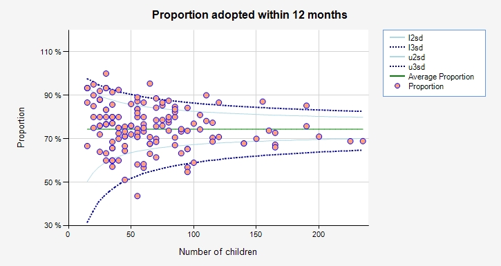
Most of the local authorities (LAs) lie within the 95% (2SD) funnel and so their variation is essentially indistinguishable from chance. Many of the more extreme authorities handle low numbers (eg York was top of the table but only handles around 10 adoption a year): many of those at the top of the league table are similarly small and have performance that is not significantly different from average.
While York and 5 other Las can be considered as having systematically better performance, only a few LAs can be confidently said to be worse than average.
Although there is clearly room for improvement, it seems inappropriate to construct a league table based on such low numbers. In addition, highlighting this one performance measure obscures the overall picture obtained from the multiple indicators.
- david's blog
- Log in to post comments

Comments
Hamish Atkinson (not verified)
Tue, 01/11/2011 - 2:39pm
Permalink
Your argument is a tautology. But consider...
By arguing that most results fall within two standard deviations, you are really just saying "these results more or less follow a normal distribution".
To translate what Cameron is saying from political rhetoric into statistical speak "The standard deviation of this normal distribution is too large".
Obviously Cameron's speech writers are going to compare the points at the bottom of the distribution with those at the top - it just sounds more dramatic that way to Joe Public. And yes, us statistic-literates are going to understand that achieving results with no random spread is impossible.
But is it really so unrealistic to expect most (>~90%) local authorities to place most (>~75%) kids with foster families in less than 12 months? Well maybe.
These figures don't show the factors affecting the performance of local authorities. How many parents have registered to adopt in each area? What proportion of the kids have very difficult backgrounds, making the harder to place? Do the same authorities keep appearing at the top and bottom of the distribution, or do their performances vary from year to year? How well resourced are the local authorities? Are there effective adoption charities operating in some areas, but not others? Is there a correlation between well resourced family and adoption services and quick placement? Unless you actually graph these factors, they will only appear as random noise, causing the funnel plot that you have shown.
I haven't heard Cameron's speech. If he's talking about it, maybe his think tanks have looked at the causes and think there's something they can fix without spending too much money. (Remember this is a Conservative-led coalition).
But, let's judge by results. Put a date in your diary to re-plot this curve just before the next election. Then maybe we'll see whether it was just spin...
david
Tue, 01/11/2011 - 6:13pm
Permalink
random variation
I agree we need to look at reasons for variation, but the funnel is not tautological since these are binomial and not normal limits: no variance is estimated, the limits are pure random noise.
P Smith (not verified)
Thu, 03/11/2011 - 2:26pm
Permalink
Another doubtful league table
Rick Wicklin (not verified)
Fri, 04/11/2011 - 1:20pm
Permalink
ERPHO’s funnel plot generator
Very nice presentation. I had not seen the ERPHO funnel plot generator before. Thank you for that link.
With regard to the ERPHO funnel plot generator, is it possible that it uses a slightly different control limits than found in Spiegelhalter (2005, Statist. Med.)? On these data, for N=15, ERPHO gives limits of L3sd=31.6% L2sd=50.4% U2sd=93.3% U3sd=97.6%.
When I compute the exact binomial limits given in Appendix A.1.1, which use the binomial CDF and inverse CDF, I get slightly different numbers for N=15: L3sd=33.4% L2sd=47.4% U2sd=91.9% U3sd=99.4% (and other values of N are also different).
I've probably a mistake, but I thought I'd ask before I review my code (and your paper) yet again. Cheers.
n<-15
theta<-0.743937
p<-c(0.001, 0.025, 0.975, 0.999)
r<-qbinom(p,n,theta)
alpha<-(pbinom(r,n,theta)-p)/(pbinom(r,n,theta)-pbinom((r-1),n,theta))
limits<-(r-alpha)/n
E P (not verified)
Mon, 07/11/2011 - 8:28am
Permalink
random variation?
david
Mon, 07/11/2011 - 11:02am
Permalink
random variation
yes this is only an exploratory analysis, but if everything lies in the funnel there is no point in further research as the variability is compatible with chance variation (what this actually means is of course rather a big issue). The funnel above shows limited over-dispersion, which suggests there are some unobserved factors leading to a slight increase in variance over the Binomial, and so further study of the outliers is warranted. But we should not expect to find anything very dramatic.
david
Mon, 07/11/2011 - 11:04am
Permalink
funnel plot limits
Rick, I have not checked the ERPHO limits, but someone else has questioned their accuracy. I am sure they don't use our interpolated limits - maybe they use a cruder inverse Binomial?