Why 'life expectancy' is a misleading summary of survival
As of the 23rd May 2022 this website is archived and will receive no further updates.
understandinguncertainty.org was produced by the Winton programme for the public understanding of risk based in the Statistical Laboratory in the University of Cambridge. The aim was to help improve the way that uncertainty and risk are discussed in society, and show how probability and statistics can be both useful and entertaining.
Many of the animations were produced using Flash and will no longer work.
It's well-known how misleading it can be to use average (mean) as a summary measure of income: the distribution is very skew, and a few very rich people can hopelessly distort the mean. So median (the value halfway along the distribution) income is generally used, and this might fairly be described as the income of an average person, rather than the average income.
But, like everyone else dealing with actuarial statistics, I use life expectancy (the mean number of future years) to communicate someone's survival prospects. And yet, just as for income, it is also a poor measure due to the skewness of the distribution of survival.
This can be clearly shown by looking at the life tables published by the Office for National Statistics (ONS) : these have a convenient column labeled $d_x$, which is the probability density for survival, expressed as the expected number of deaths at each age out of 100,000 births, assuming the current mortality rates continue. The density plots for women and men are shown below, using the life tables for 2010-2012. The distributions have a small peak for babies dying in the first year of life, and then a long left-tail for early deaths, and then a sharp peak and a rapid fall up to age 100. The ‘compression’ of mortality is clear.
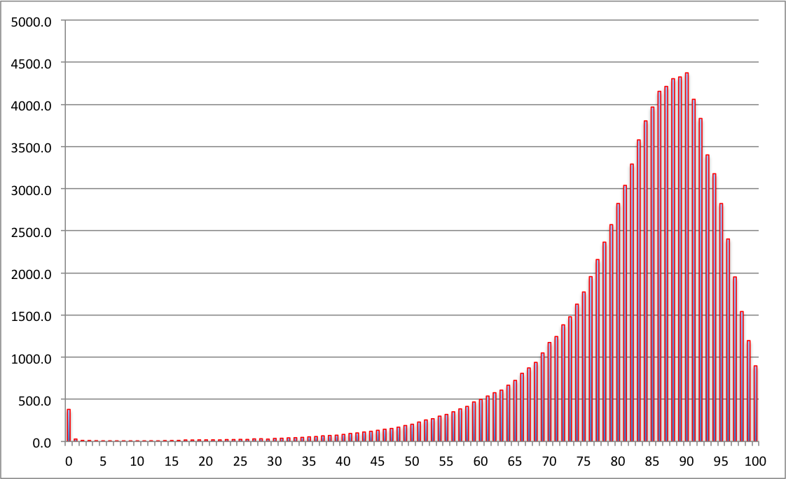
Numbers of women expected to die at each age, out of 100,000 born, assuming mortality rates stay the same as 2010-2012. The expectation is 83, median 86, the most likely value (mode) is 90.
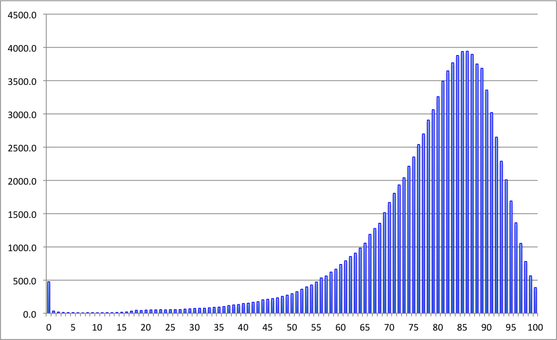
Numbers of men expected to die at each age, out of 100,000 born, assuming mortality rates stay the same as 2010-2012. The expectation is 79, median 82, the most likely value (mode) is 86.
Left-skewed distributions are rather unusual, but have similar issues as any skew distribution - the mean, median and mode can be very different. For these survival distributions it is perhaps remarkable how far the mode is from the mean: for girls born now, even assuming there are no more increases in survival, their most likely age to die is 90, seven years more than the mean on 83. For little baby boys the mode is 86, again seven years more than the mean of 79. And even the median is 3 years more than the mean. That's why I now believe that 'life expectancy' is misleading.
Of course these ‘period life tables’ unrealistically assume mortality will stay the same in the future, whereas life expectancy has been growing at around 3 months a year for decades, corresponding to the annual risk of death reducing at about 2% per year. The ONS also provide ‘cohort life tables’ that make various projections about whether these trends will continue in the future: the 'central projection' says girls born now have a life expectancy of 94, with (according to my rough calculations) a median and mode of around 100, and men have a life expectancy of 91, with a median and mode of around 96. Under the ‘high' projections, with the possibly implausible assumption that the increases continue at the same rate in the future, children born today will on average live more than 100 years. Good luck to them - heaven knows how long they will have to work for.
- david's blog
- Log in to post comments

Comments
alison@oconnell...
Tue, 07/10/2014 - 9:16pm
Permalink
Misleading life expectancy
Nick Ergodos
Tue, 26/05/2015 - 6:19am
Permalink
The median is always better
Feldheld
Sun, 14/01/2018 - 2:12pm
Permalink
Interesting graphs
Zac Scott
Fri, 17/08/2018 - 9:19pm
Permalink
Bathtub Curves