Quantifying the Risk of Natural Catastrophes
As of the 23rd May 2022 this website is archived and will receive no further updates.
understandinguncertainty.org was produced by the Winton programme for the public understanding of risk based in the Statistical Laboratory in the University of Cambridge. The aim was to help improve the way that uncertainty and risk are discussed in society, and show how probability and statistics can be both useful and entertaining.
Many of the animations were produced using Flash and will no longer work.
 How do companies prepare for the financial impact of natural catastrophes? How can they possibly have an idea of what the potential cost can be for events that haven't yet happened? Shane Latchman explains the way companies in the insurance industry are using catastrophe models to help make sense of a very uncertain future...
Introduction
Catastrophe modelling companies serve to measure the financial impact of natural catastrophes on infrastructure, with a view to estimating expected losses. Although natural catastrophes often have a grave humanitarian impact with regard to loss of life, this aspect is not currently included and only the event’s financial impact will be discussed below. The purpose of catastrophe modelling (known as cat modelling in the industry) is to anticipate the likelihood and severity of catastrophe events—from earthquakes and hurricanes to terrorism and crop failure—so companies (and governments) can appropriately prepare for their financial impact.
In this article we will explain the three main components of a cat model, starting with an event’s magnitude and ending with the damage and financial loss it inflicts on buildings. We then discuss what metrics are used in the catastrophe modelling industry to quantify risk.
The Three Modules
A catastrophe model can be roughly divided into three modules, with each module performing a different step towards the overall calculation of the loss that results from a catastrophe.
Hazard Module
The hazard module looks at the physical characteristics of potential disasters and their frequency, whereas the vulnerability module assesses the vulnerability (or “damageability”) of buildings and their contents when subjected to natural and man-made disasters.
The very first task when trying to estimate potential future losses from a peril is to create a catalogue of possible future events, which form the basis for drawing conclusions about the perils (e.g. hurricanes) that may strike, their intensity, and the likelihood that they will strike.
Statistical and physical models are used to simulate a large catalogue of events. For example historical data on the frequency, location, and intensity of past hurricanes are modeled and used to predict 10,000 scenario-years of potential hurricane experience. Each of the 10,000 years should be thought of as 10,000 potential realisations of what could happen in the year 2010, for example, and not simulations—or predictions—of hurricane activity from now until the year 12010. A notional 10,000 year sample is simulated and the collection of resulting events is called an ensemble. Within the ensemble we have information on the characteristics of the event, as well as the simulated year of its occurrence, so that over the 10,000 year catalogue we might have, say, 30,000 events and in our output we may have 0 events in Year 1, 3 in Year 2, 1 in Year 3 and so on. Thus any year in the catalogue gives a snapshot of the potential hurricane experience in a single calendar year.
While the event catalogue doesn't consist of events that have actually happened in the past, historical data on the frequency, location, and intensity of past hurricanes is used to generate a realistic 10,000 year simulation. Since the past is not always indicative of the future, the event catalogue therefore can include events that are more extreme than those that have occurred in the past (in accordance with their probability of occurrence).
The vulnerability module
After simulating an event of a given magnitude, the damage it does to buildings must now be computed. The extent to which a particular building will be damaged during a hurricane depends on many factors, but certain characteristics of a building serve as good indicators of its vulnerability and, in particular, of its likely damage ratio. The damage ratio is the ratio of the cost to repair a building to the cost of rebuilding it.
It is, of course, quite possible for seemingly identical buildings to experience different levels of damage when impacted by the same intensity of windspeed. This is due to small differences in construction and local site-specific effects that can have a major impact on losses. To capture this variability in damage, we look not at a single value for the damage ratio, but at a whole distribution of possible values. The mean of this distribution is known as the mean damage ratio. A graph of the mean damage ratio as a function of intensity (e.g. wind speed for hurricanes) is plotted below and is called a vulnerability function. The graph below (left plot) shows that as the intensity increases, the mean damage ratio also increases, as expected.
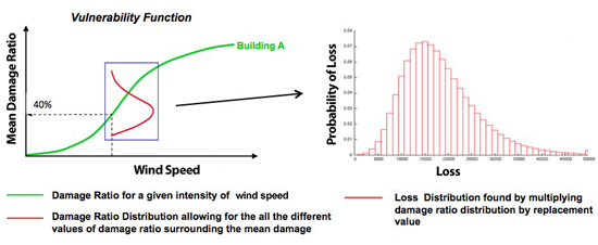
Figure 1: Graph showing relationship between Vulnerability Module (left) and Financial Module (right)
Financial Module
The damage ratio distribution for a specific event is then multiplied by the building replacement value to obtain the loss distribution (Figure 1 above, right plot). These calculations are done within the financial module which also incorporates specific insurance policy conditions that are crucial in accurately determining the insurer's loss. This module computes the combined loss distribution of all buildings through a process known as convolution. This is a means of computing all possible combinations of the loss distributions $L_i + L_j$ , and their associated probabilities, given the probability distributions of $L_i$ and $L_j$ separately. In this case, $L_i$ and $L_j$ are the loss distributions for two locations, 1 and 2 respectively, for each event. This is shown formally below, where $L$ represents the total loss for 2 locations, $P_1(L_i)$ is the probability distribution for location 1, and $P_2(L_j)$ the probability distribution for location 2.
$$P(L) = \sum_{L=L_i+L_j} P_1(L_i) \times P_2(L_j)$$
This is illustrated in Figure 2 below. We can see that if we have two loss distributions for the two locations (shown in the top plots), then when these are convolved, the range of the resulting loss distributions is equal to the sum of the ranges of the individual loss distributions. We can also see, that to get a total loss of 10, this is brought about by three combinations (0,10), (10,0) and (5,5). The individual probabilities for each component of the combinations are multiplied together and the 3 products summed to give the probability of a total loss of 10.
$$P(10) = P_1(0) \times P_2(10) + P_1(10) \times P_2(0) + P_1(5) \times P_2(5)$$
This process is completed for all other possible combinations and thus the convolved loss distribution for the total loss of the two locations is obtained.
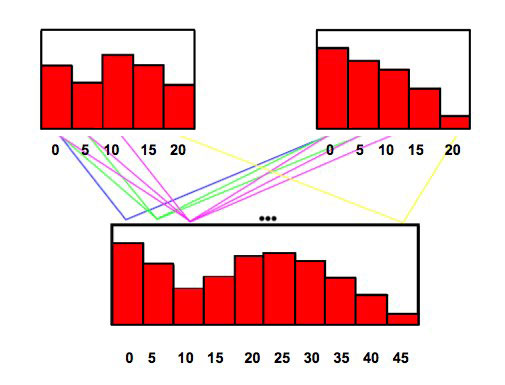
Figure 2: Figure showing the result of convolution on two loss distributions
Risk Quantification
Exceedance Probability Curves
An Exceedance Probability curve (known as an EP curve) describes the probability that various levels of loss will be exceeded. For example, if we simulate 10,000 years of hurricanes (outlined in the Hazard section above), the highest causing loss will have a 0.01% chance of being exceeded. This is because there is only one event with a loss greater than or equal to that loss in 10,000 years of events (1/10,000 = 0.01%).
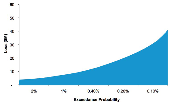
Figure 3: Graph showing Exceedance Probability curve
An EP curve is generated by running the catalogue against exposure (buildings) and obtaining losses for each event and year. The events are then grouped by year (the reader should recall at this point that each simulated event has a simulated year to which it is associated) to determine the loss-causing events for each year. The total mean loss for each year is then found by adding the mean losses for each event together. It should also be noted that the mean of the convolved loss distribution for a year is the same as the sum of the mean losses of each event in that year. The losses are then sorted in descending order and plotted to give the exceedance probability and corresponding loss at that probability. The EP curve is the basis upon which insurers estimate their likelihood of experiencing various levels of loss.
Another common form of the above curve is to invert the exceedance probability to obtain the corresponding return period. For example, we can estimate the loss from a certain hurricane, find where that lies on the exceedance probability curve, and invert the exceedance probability to deduce, for example, that that hurricane has an exceedance probability of 1%, for a particular insurer’s portfolio, it is therefore a “1 in 100 year storm”.
Nevertheless, although a loss of, say, \$100m has an annual loss exceedance probability of just 1% in any given year, this probability compounds over several years. For example, a 1% annual exceedance probability of a \$100m loss compounds to 9.6% (1−0.910) probability over 10 years. Consideration of the compounding of loss exceedance probabilities should also be taken into account by the insurer.
As regards correlation of building losses based on geographic distance, the beauty of cat models is that the correlation of losses is built in from the ground up by virtue of the model knowing the location of each risk. Thus the EP curve already takes into account geographical correlation and so correlation does not need to be added in after assembling the EP curve.
Percentiles
One way for insurers to assess the potential payouts that could be required at various return periods is through plotting percentiles around the EP curve
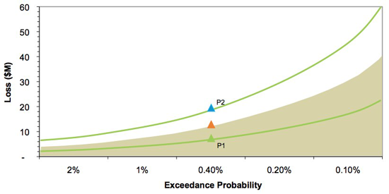
Figure 4: Graph showing percentiles around Exceedance Probability Curve
As can be seen in Figure 4, an insurer can assess their risk at the 250-year (0.4% exceedance probability) return period by looking at the mean loss at that return period—\$10m in this example—and observe the range of losses from the 5th to 95th percentile—\$7m to \$19m. Note that there are two sets of probabilities involved; that is, if 10,000 years are run and when all the losses are computed and ranked, the 40th largest loss (corresponding to the 10,000/40 = 250 year return period) will produce a loss with a 90% confidence interval of \$7m to \$19m. These percentiles are produced by the Vulnerability Module and are the result of similar buildings having a different response to the same level of intensity of the event; this is explained in more detail in the Vulnerability Section above. To capture this variability in damage, we thus look not at a single value for the loss, but at a whole distribution of possible values, and looking at particular percentiles is a useful way to visualise this variability.
Another observation concerning percentiles is the relative narrowing of the bands as the number of locations increases. We can see below that as the number of locations increases, the relative uncertainty (also known as the coefficient of variation) decreases at each exceedance probability. The coefficient of variation is the ratio of the standard deviation of loss of an event to the mean of that event and decreases as the number of locations increases. This means that more locations leads to higher relative certainty: this is an example of the general statistical rule that larger sample sizes lead to estimates with lower relative error.
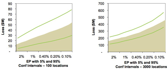
Figure 5: Graph showing the narrowing of percentile bands as the number of locations increases
Tail Value at Risk
Another measure sometimes used to estimate risk is Tail Value at Risk (TVaR). This metric finds the average of all losses beyond a specified return period. For example, the 5,000 year TVaR is the average of the largest and second largest losses. Thus if an insurer would like to keep reserve capital (capital required to pay out to home and business owners after catastrophes) to withstand a 1 in 250 year loss, the insurer may decide to look at the 1 in 250 year TVaR amount, which will allow for losses greater than the 250 year return period.
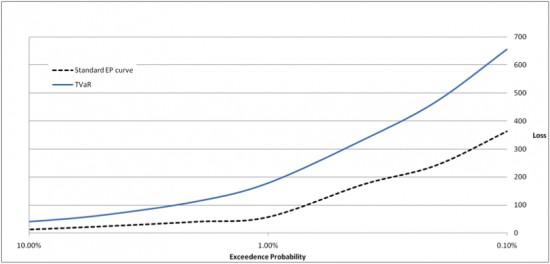
Figure 6: Plot of TVaR and EP curve
Catalogue size
Another means of estimating risk is for an insurer to run different sized catalogues against their exposure. This allows for an alternative view of risk, looking at a larger number of events; for example using a 50,000 or 100,000 year catalogue of events. Larger catalogues will usually contain larger maximum events but the EP curve for the 50,000 year catalogue is not necessarily bounded above the 10,000 year catalogue.
Pricing
Some insurers use the results of catastrophe models as one input into pricing policies. A policy is a contract between an insurer and the insured that requires the insurer to pay claims on the policy. The policy can consist of a group of buildings distributed over a wide or small geographic area and that are insured for individual or multiple perils (e.g. hurricanes and earthquakes). Insurers can model an individual policy and obtain metrics, such as the annual expected loss and the standard deviation of this loss and use this (after accounting for commission, expenses, profit loading and so on) to help calculate the amount they should charge the policyholder to allow for reasonable profit while minimising the risk of insolvency (bankruptcy).
Conclusion
We have seen that the hazard module gives us a way of assessing the extent to which a particular region is at risk from natural and man-made (e.g. Terrorism) catastrophes of various magnitudes. Then the vulnerability and financial modules allow us to compute the loss due to damage from these catastrophes. Finally, we saw the use of the Exceedance Probability curve in estimating risk from extreme events and using percentiles and other risk metrics to aid the interpretation of the EP curve. So while we may not be able to avert disasters, we can at least prepare for their financial impact.
About the author

Shane Latchman works as a Client Services Associate with the catastrophe modelling company AIR Worldwide Limited (www.air-worldwide.com). Shane works with the earthquake model for Turkey, the hurricane model for offshore assets in the Gulf of Mexico and the testing and quality assurance of the Financial Module. Shane received his BSc in Actuarial Science from City University and his Masters in Mathematics from the University of Cambridge, where he concentrated on Probability and Statistics.
- Log in to post comments

Comments
Anonymous (not verified)
Sun, 02/05/2010 - 11:44pm
Permalink
Black Swans
Anonymous (not verified)
Fri, 09/07/2010 - 6:56pm
Permalink
Indirect financial impacts
Anonymous (not verified)
Wed, 11/08/2010 - 10:30pm
Permalink
Business Interruption losses are modelled