Mathematics of the Coxcombs
As of the 23rd May 2022 this website is archived and will receive no further updates.
understandinguncertainty.org was produced by the Winton programme for the public understanding of risk based in the Statistical Laboratory in the University of Cambridge. The aim was to help improve the way that uncertainty and risk are discussed in society, and show how probability and statistics can be both useful and entertaining.
Many of the animations were produced using Flash and will no longer work.
What are coxcombs?
Coxcombs, just like bar charts or pie charts, are graphical systems of representing data. They are sometimes referred to as polar area charts or roses. (Despite many claims to the contrary, Nightingale did not originally refer to the graphs as coxcombs; see Florence Nightingale's Statistical Diagrams for an explanation of this error.)
Consider the following bar chart.
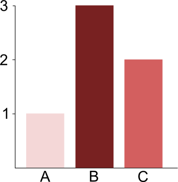
A simple bar chart
Category A has value 1, category B has value 3, and category C has value 2. In the next figure, this same set of data is represented in a coxcomb.

A simple coxcomb
Each category is represented by a sector of a disc. The sectors each have the same angle. In this case, as there are three sectors, each sector has angle, in degrees,
$$ \frac{360}{3} = 120.$$
The area of a sector represents the value for the corresponding category. So, for example, if $r_A$ is the radius of sector A then
$$ \text{Area of sector A} = \frac{\pi r_A^2}{3}=1,$$
because 1 is the value of category A. Likewise
$$ \text{Area of sector B} = \frac{\pi r_B^2}{3}=3$$
and
$$\text{Area of sector C} = \frac{\pi r_C^2}{3} = 2.$$
We can solve these equations to determine $r_A$, $r_B$, and $r_C$, enabling us to plot the coxcomb.
It is important to notice that it is the area, rather than the radius, of a sector that represents the value of that sector. The values of the sectors are proportional to the squared radii of the sectors.
Nightingale's coxcombs
In 'Nightingale's Coxcombs' we displayed a pair of coxcombs drawn by Nightingale, and an animated reproduction of this pair of coxcombs. The categories of these coxcombs were the months of the year. There are twelve months in the year, so the angle of each sector is, in degrees,
$$\frac{360}{12} = 30.$$
The data represented by the coxcombs are deaths each month for British soldiers in the Crimean War. Let us consider exactly the mathematics that Nightingale used in order to calculate the data for deaths by diseases (the blue portion of the graph). Suppose that on average during a particular month there were S soldiers, and D of these soldiers died of diseases during that month. Nightingale considered the proportion of soldiers who died of diseases; that is, she considered the quantity D/S. Next, she wished to express this quantity as a figure out of 1000, so she multiplied it by 1000, to obtain N=1000D/S. Thus, in that month, N out of every 1000 soldiers died of diseases. Finally, Nightingale multiplied N by 12 to indicate how many soldiers would have died from diseases throughout the whole year had the circumstances of that month been replicated throughout the year. She described the final quantity that she obtained as the 'annual rate of mortality per 1000 in each month'. As we have seen, it is given by the formula
$$\frac{12000D}{S}.$$
This is the value of the area of the blue sector for the particular month that we are considering. Of course, area depends on the unit of measurement, so Nightingale will have scaled all her values appropriately. Since coxcombs do not have scales, Nightingale need not have multiplied D/S by 12000 in order to plot the coxcombs. The bar chart in our reproduction of Nightingale's work records 'monthly mortality per 1000'; that is, the quantity N=1000D/S.
The figures used to produce the 'Diagram of the Causes of Mortality in the Army in the East' are shown in the following table. The table was taken from 'A contribution to the sanitary history of the British army during the late war with Russia', by Florence Nightingale, 1859, and it was provided to us courtesy of Hugh Small. Note that the second column represents S, the third column represent D, and the sixth column represents 12000D/S.
| Deaths | Annual rate of mortality per 1000 | ||||||
|---|---|---|---|---|---|---|---|
| Month | Average size of army | Zymotic diseases | Wounds & injuries | All other causes | Zymotic diseases | Wounds & injuries | All other causes |
| Apr 1854 | 8571 | 1 | 0 | 5 | 1.4 | 0 | 7.0 |
| May 1854 | 23333 | 12 | 0 | 9 | 6.2 | 0 | 4.6 |
| Jun 1854 | 28333 | 11 | 0 | 6 | 4.7 | 0 | 2.5 |
| Jul 1854 | 28722 | 359 | 0 | 23 | 150.0 | 0 | 9.6 |
| Aug 1854 | 30246 | 828 | 1 | 30 | 328.5 | 0.4 | 11.9 |
| Sep 1854 | 30290 | 788 | 81 | 70 | 312.2 | 32.1 | 27.7 |
| Oct 1854 | 30643 | 503 | 132 | 128 | 197.0 | 51.7 | 50.1 |
| Nov 1854 | 29736 | 844 | 287 | 106 | 340.6 | 115.8 | 42.8 |
| Dec 1854 | 32779 | 1725 | 114 | 131 | 631.5 | 41.7 | 48.0 |
| Jan 1855 | 32393 | 2761 | 83 | 324 | 1022.8 | 30.7 | 120.0 |
| Feb 1855 | 30919 | 2120 | 42 | 361 | 822.8 | 16.3 | 140.1 |
| Mar 1855 | 30107 | 1205 | 32 | 172 | 480.3 | 12.8 | 68.6 |
| Apr 1855 | 32252 | 477 | 48 | 57 | 177.5 | 17.9 | 21.2 |
| May 1855 | 35473 | 508 | 49 | 37 | 171.8 | 16.6 | 12.5 |
| Jun 1855 | 38863 | 802 | 209 | 31 | 247.6 | 64.5 | 9.6 |
| Jul 1855 | 42647 | 382 | 134 | 33 | 107.5 | 37.7 | 9.3 |
| Aug_1855 | 44614 | 483 | 164 | 25 | 129.9 | 44.1 | 6.7 |
| Sep 1855 | 47751 | 189 | 276 | 20 | 47.5 | 69.4 | 5.0 |
| Oct 1855 | 46852 | 128 | 53 | 18 | 32.8 | 13.6 | 4.6 |
| Nov 1855 | 37853 | 178 | 33 | 32 | 56.4 | 10.5 | 10.1 |
| Dec 1855 | 43217 | 91 | 18 | 28 | 25.3 | 5.0 | 7.8 |
| Jan 1856 | 44212 | 42 | 2 | 48 | 11.4 | 0.5 | 13.0 |
| Feb 1856 | 43485 | 24 | 0 | 19 | 6.6 | 0 | 5.2 |
| Mar 1856 | 46140 | 15 | 0 | 35 | 3.9 | 0 | 9.1 |
- Log in to post comments

Comments
Marianne Rousson (not verified)
Tue, 04/10/2011 - 12:44pm
Permalink
Software ?