Another ghastly graphic in the TImes
As of the 23rd May 2022 this website is archived and will receive no further updates.
understandinguncertainty.org was produced by the Winton programme for the public understanding of risk based in the Statistical Laboratory in the University of Cambridge. The aim was to help improve the way that uncertainty and risk are discussed in society, and show how probability and statistics can be both useful and entertaining.
Many of the animations were produced using Flash and will no longer work.
The Times has got another classic graphic today, which manages to be hideous, misleading and incomprehensible all at the same time - quite a feat. Why is this a pie-chart? Never mind, it all provides fine material for getting laughs when giving talks.
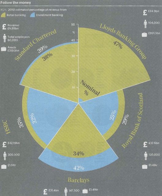
hideous, misleading and incomprehensible all at the same time
- david's blog
- Log in to post comments
